Port 73
A colorful shopping experience
Background
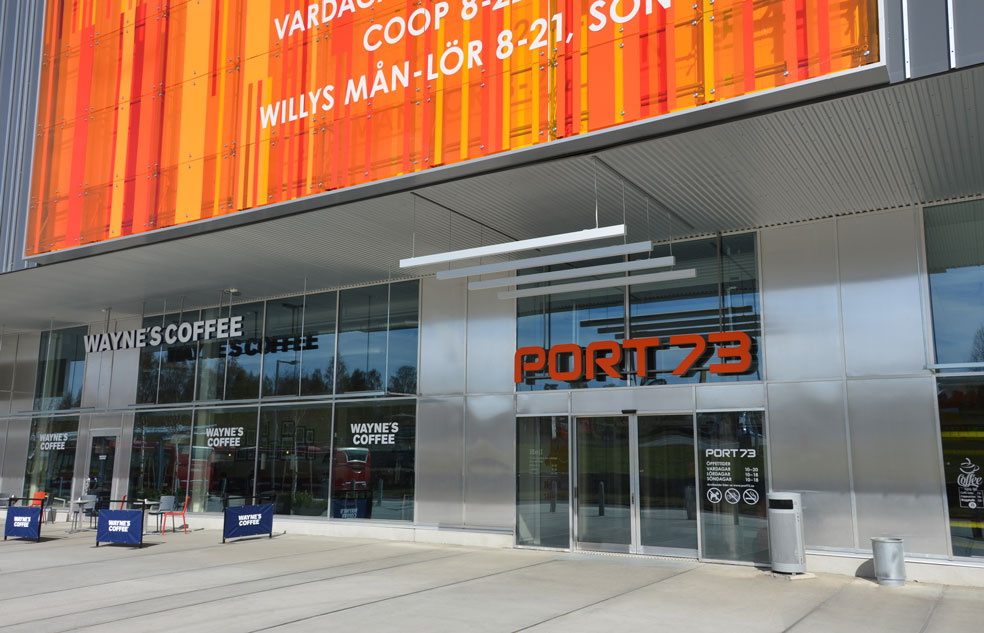
Port 73 built a new extension a year earlier. It soon became apparent that the mall was failing to communicate its retailers and the Port 73 brand to customers driving by in cars. Visually, the space was more like a warehouse.
Solution
We were tasked with developing a stronger visual and more appealing identity.
An adjusted logo and brand colors provide better readability and visual focus. We developed two 150-square-meter façade elements in bold colors that are illuminated at night. The logo turned from white to orange for better visibility. The result has a very powerful visual impact.
Services
Branding and Identity
Identity Design
Brand Activation
Environmental Design
Location Analyses
Environmental Graphic Design
Light Design
Project and Production Management
Client
Atrium Ljungberg
Sector
Retail
Fler projekt

Kvarteret GiraffenIdentity and Wayfinding
Kruthuset 17Identity and Wayfinding

GladanIdentity and Wayfinding
Solna PortIdentity and Wayfinding
JunibackenIdentity and Wayfinding
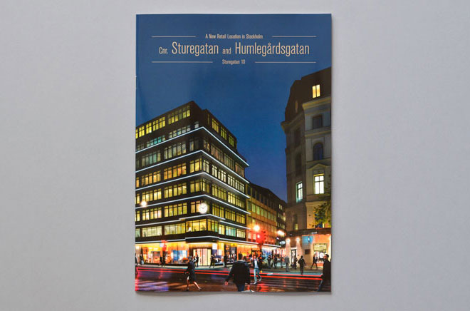
Sturegatan 10Identity and Wayfinding
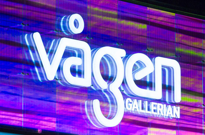
VågengallerianIdentity and Wayfinding
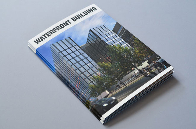
WaterfrontIdentity and Wayfinding
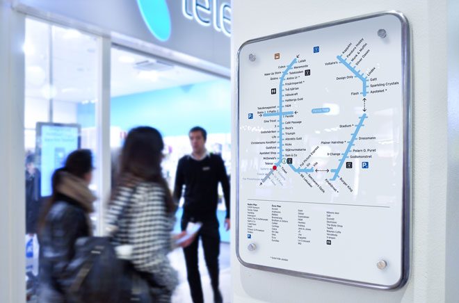
Farsta CentumIdentity and Wayfinding
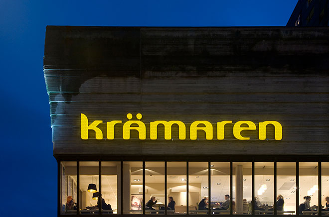
KrämarenIdentity and Wayfinding
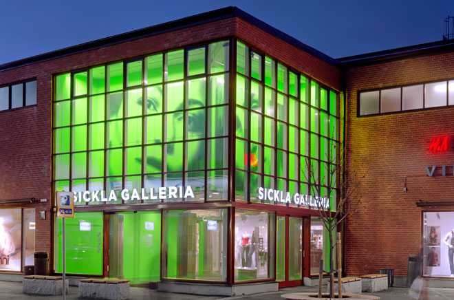
Sickla KöpkvarterIdentity and Wayfinding
Frid Horsnell Design AB
Drottninggatan 104, Stockholm
+46 (8) 644 46 80
Project Inquiry
patrik@fridhorsnelldesign.se
+46 (0)70 749 84 77
Copyright © 2002-2025
Frid Horsnell Design AB
All rights reserved.


