Gladan
Environmental design for security and enjoyment
Background
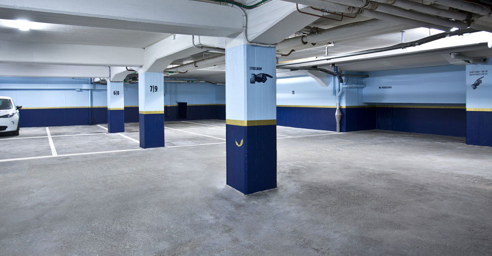
Gladan began as a bookprinting office. Could we find the building a new graphic profile that would visually improve the renovated location? Our client wanted us to turn the building into a place where tenants would feel comfort and joy, where they could grow and develop, and where they could easily orient themselves within the building.
Solution
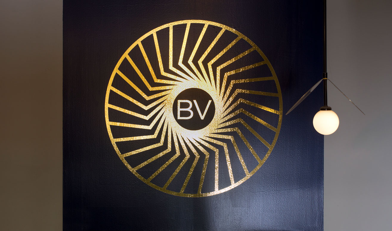
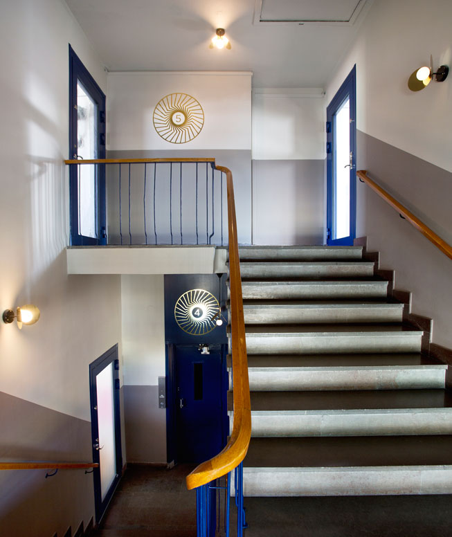
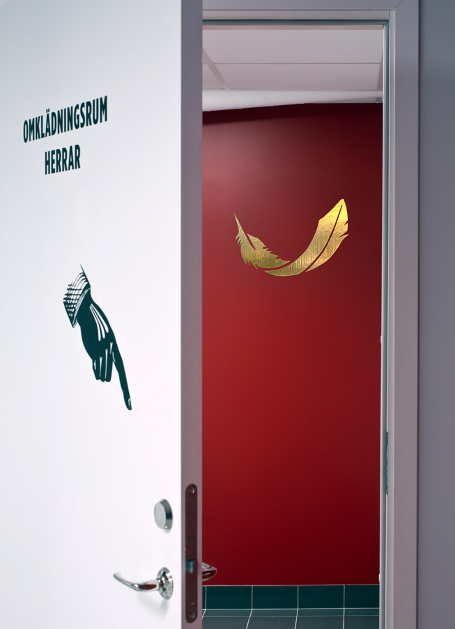
Gladan is the name of a hawk. The golden symbol represents its nest and is a metaphor for a place where one grows. The entrance sign is an unexpected jewel, and the golden graphics in the stairwells harmonize with the interior.
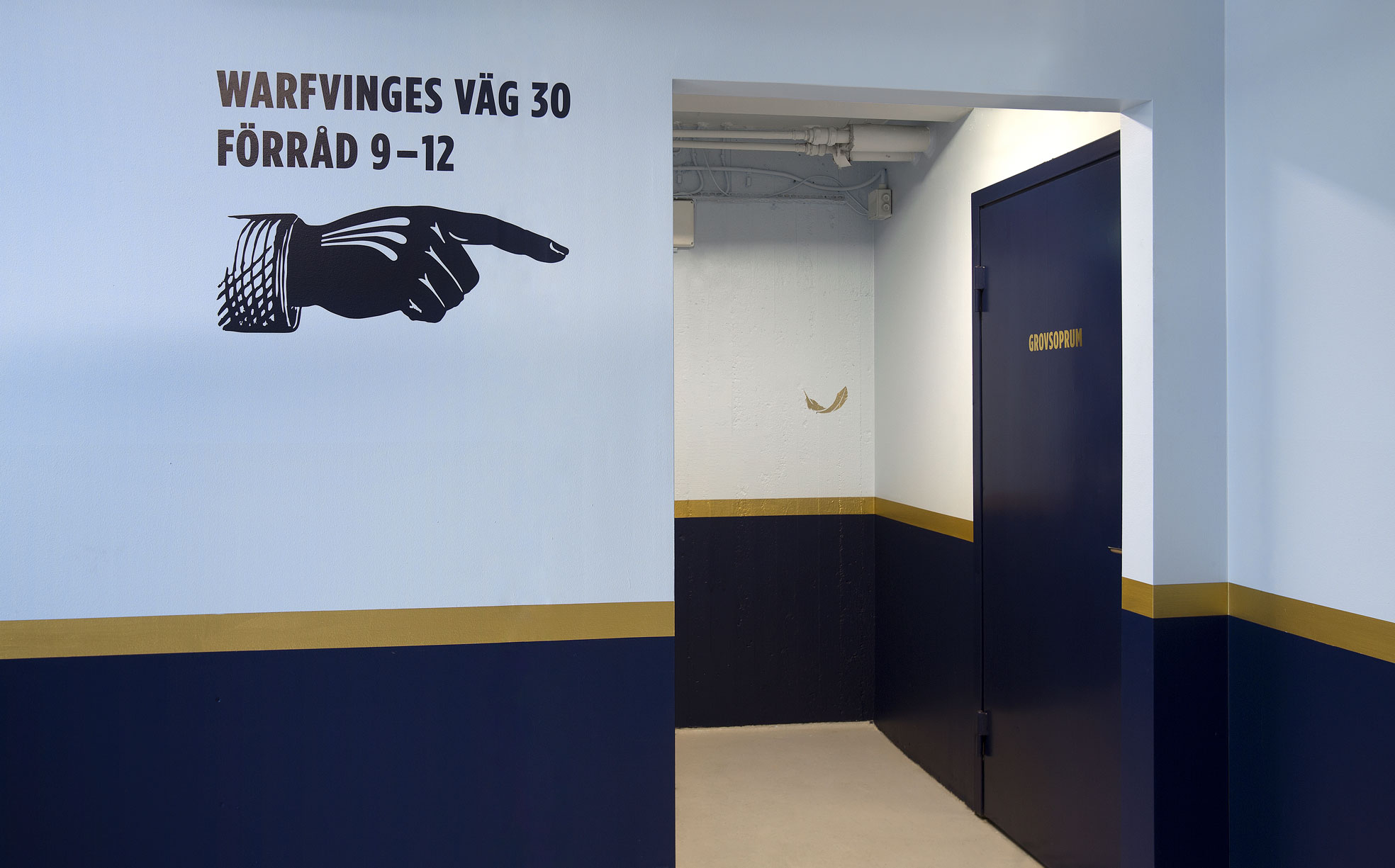
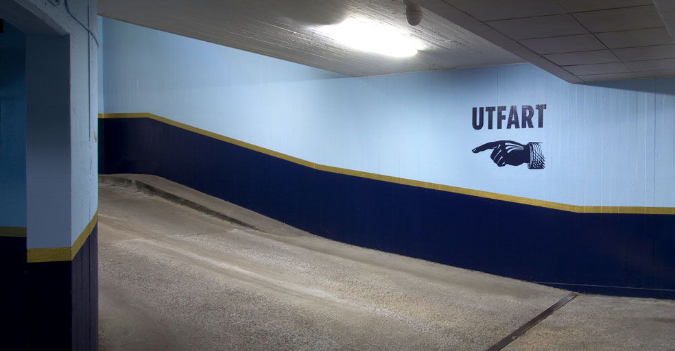
The wayfinding is inspired by printing history. Instead of arrows, we used old-fashioned hands to show the way. The building now has a new identity and wayfinding based on its history, communicating care, safety and functionality. The somewhat quirky design has added the friendly touch requested by our client.
Services
Branding and Identity
Identity Design
Wayfinding
Location Analysis
Signage and Graphic Design
Project and Production Management
Environmental Design
Location Analyses
Placemaking Design
Environmental Graphic Design
Project and Production Management
Client
Areim
Sector
Real Estate,
Office building
Photography
Stefan Nilsson, S1.Bild

Fler projekt

Kvarteret GiraffenIdentity and Wayfinding
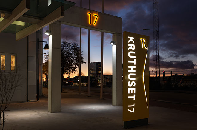
Kruthuset 17Identity and Wayfinding
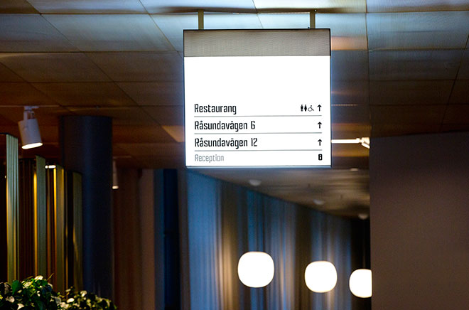
Solna PortIdentity and Wayfinding
JunibackenIdentity and Wayfinding
Port 73Identity and Wayfinding
Sturegatan 10Identity and Wayfinding
VågengallerianIdentity and Wayfinding
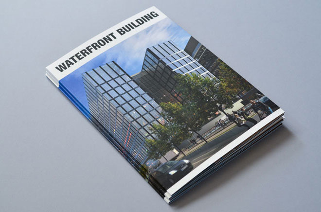
WaterfrontIdentity and Wayfinding
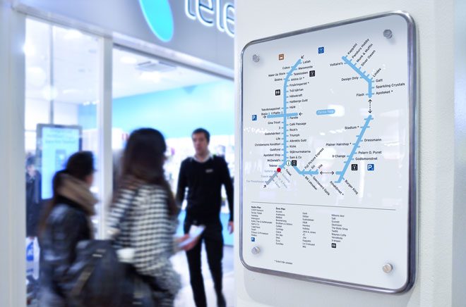
Farsta CentumIdentity and Wayfinding
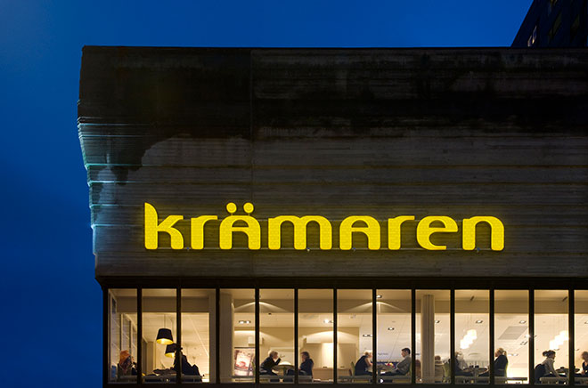
KrämarenIdentity and Wayfinding
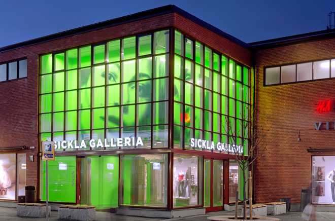
Sickla KöpkvarterIdentity and Wayfinding
Frid Horsnell Design AB
Drottninggatan 104, Stockholm
+46 (8) 644 46 80
Project Inquiry
patrik@fridhorsnelldesign.se
+46 (0)70 749 84 77
Copyright © 2002-2025
Frid Horsnell Design AB
All rights reserved.

